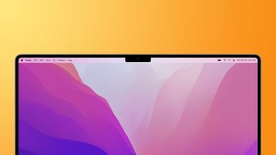
The notch on the newly redesigned MacBook Pro offers a "smart way" to give users more room for their content and allowed Apple to make the bezels thinner and provide more screen real estate to customers, an Apple official has said during a recent media interview.

The inclusion of a notch on the entirely revamped MacBook Pros was a surprise and was one of the few last-minute rumors that surfaced ahead of Apple's "Unleashed" event last week. As expected, some social media users have criticized Apple's design choice of adding a notch to the display.
Addressing the company's decision, Shruti Haldea, a manager for the Mac product line and one of the presenters of last week's Apple event, said during an interview on the Same Brain podcast that the notch is a "smart" solution for the Mac as it provides users more room for their content by moving the macOS menu bar out of the way.
What we've done is we've actually made the display taller. Like on the 16-inch notebook, you still have a 16.0 active area on the diagonal in that 16:10-inch window, and we just grew the display up from there and put the menu bar up there. We just kind of moved it up and out of the way. So it's a really smart way to give you more space for your content, and when you're in full-screen mode, you have that 16:10 window, and it looks great. It's seamless.
Compared to previous iterations of the MacBook Pro design, the new 14-inch and 16-inch models do feature significantly smaller bezels. Apple says the bezels are 24% thinner than the previous generation on the left and right sides of the display, measuring only 3.5mm. On the top, thanks to the notch, the bezel is 60% thinner, also measuring at 3.5mm.
While the notch is noticeable at first, Apple is betting on some macOS software features, including dark mode, to help minimize how noticeable it is to some users in day-to-day use. For example, when macOS apps are in full-screen mode, the system adds a black border to the top of the display, hiding the notch while not interfering with a user's content. Developers can choose to have their app's content shown on either side of the notch.
The notch is one many changes to the new MacBook Pros. The new laptops feature an entirely redesigned chassis, additional ports such as HDMI and an SD card slot, MagSafe, a mini-LED display with ProMotion, and either the M1 Pro or M1 Max chips, which are the first Apple silicon chips designed for professional consumers.
Both the 14-inch and 16-inch MacBook Pro models became available for pre-order last week and will start arriving to customers on Tuesday, October 26. Both sizes can be configured with either the M1 Pro or M1 Max chips, giving users substantial performance gains compared to the M1 Apple silicon chip. Learn more about the new MacBook Pros using our detailed roundup.
"Give" - Google News
October 25, 2021 at 02:35AM
https://ift.tt/3vFrmzW
Apple Says Notch is a 'Smart Way' to Give Users More Space for Content on New MacBook Pros - MacRumors
"Give" - Google News
https://ift.tt/2YqGX80
https://ift.tt/2YquBwx
Bagikan Berita Ini


0 Response to "Apple Says Notch is a 'Smart Way' to Give Users More Space for Content on New MacBook Pros - MacRumors"
Post a Comment